Class: Logo Design & Branding
Symbols Logo Project
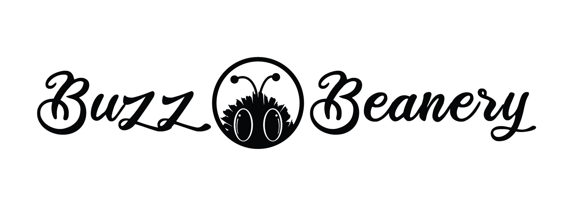
For this fictitious company I wanted the brand to be fun, yet professional.
I chose the bee as the organic object for the symbol due to the vast abstract possibilities it would allow. I wanted to step out of the norm of the bee as a sideview with a close-up instead.
Connecting the busy nature of the bee along with my love of coffee, the name Buzz Beanery came to be.
For the wordmark, I wanted a handwriting type script and came across 'Ballet Harmony'. The curls and swashes on the B's and z's remind me of the invisible trail a bee would make in flight, making it this typeface the perfect choice.
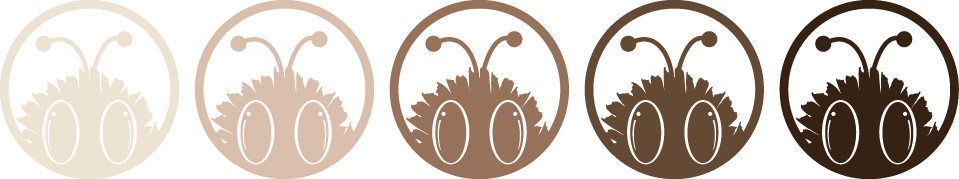
The colors were chosen to represent the many tones and types of coffee based drinks.